Three Shades, One Statement: Inside the Adeja Creations Liquid Lipstick Shoot
- Antonio Ayala
- May 1
- 2 min read

There is something quietly powerful about a nude lipstick made for brown skin. Not beige. Not pale pink. Actually nude.
When Adeja Creations brought me in to shoot this collection, I already knew this was not going to be a basic product shoot. Three liquid lipstick shades, each one pulled from a spectrum that actually honors melanin-rich skin. A warm nude. A dusty mauve. A deep espresso brown that looks like it belongs on a runway. My job was to let the product speak without getting in the way of it.
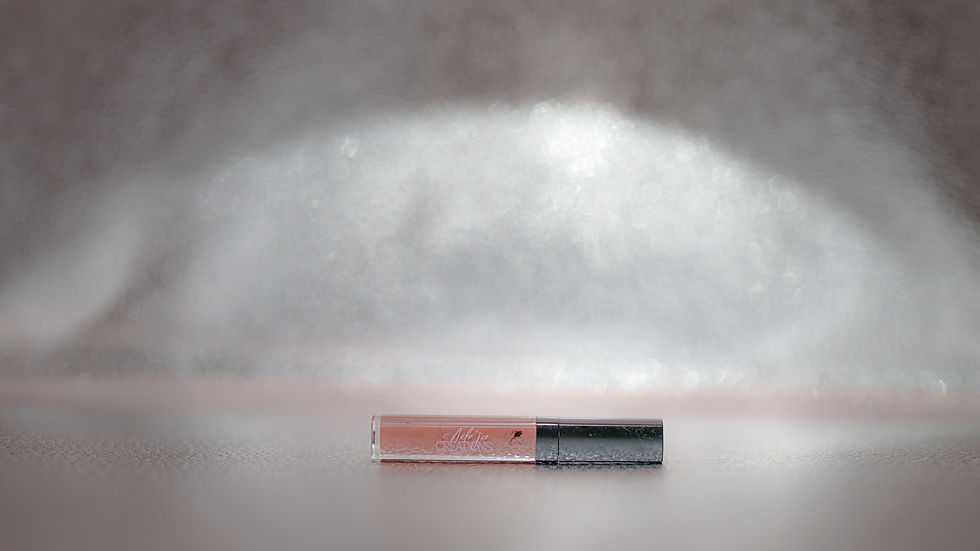
The flatlay setup was intentional from the start. I wanted the tubes to feel like they were in conversation with each other, not just lined up like items in a catalog. Laying them diagonal, caps separated, gave the frame movement and tension. The swatches were my favorite part to style. They are not just color samples. They are proof. Proof that the formula is rich, that the pigment is real, that someone thought carefully about who they were making these for. I wanted whoever saw this image to feel that before they even read a word about the product.
The edit was all about restraint. I pulled the temperature cool and let the tones sit muted against that light gray surface. That choice was deliberate. When you desaturate everything around warm pigment, the pigment wins. The nude, the mauve, the deep brown, they all pop without me having to force anything. A soft vignette around the edges brings the eye inward and gives the whole frame a premium, editorial weight. This is not a drugstore shelf photo. It is a brand identity photo. There is a difference, and the edit is where that difference lives.
What I keep coming back to with this set is who it is for. The beauty industry spent decades telling women with deeper skin tones that nude meant something that looked nothing like them. Adeja Creations is pushing back on that quietly and confidently, through the actual shades they choose to make. My role in this shoot was to honor that intention with every decision I made, from the angle to the light to the way I graded the final frame. The image needed to feel sophisticated and warm at the same time, because that is exactly what this brand is.
Beauty photography is easy to do passably. Clean background, decent light, sharp focus. But work worth remembering requires more than that. It requires understanding what a brand actually stands for and translating that into a frame before the viewer reads a single word. That is what I was going for here, and that is the standard I hold every product shoot to.
Book a call with me at falucreative.com/booking-calendar/discovery-call to talk about capturing the next moment you don't wanna miss.

Comments