Two Shades, One Statement: Shooting Liquid Lipstick for Adeja Creations
- Antonio Ayala
- May 22
- 2 min read
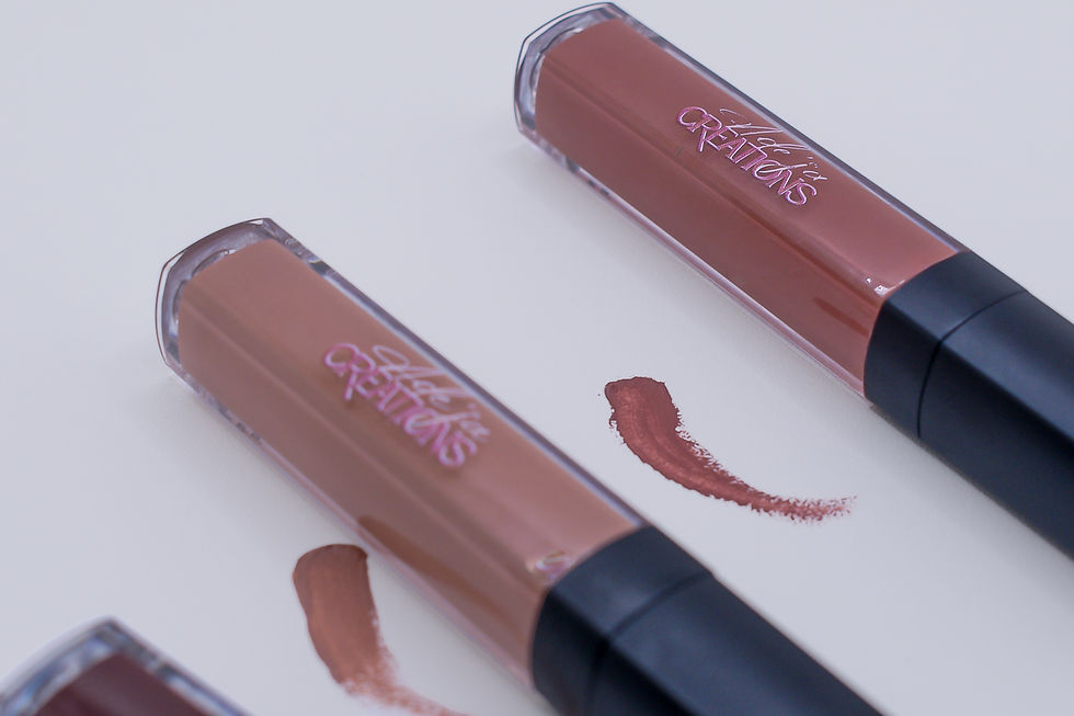
Two tubes sitting on a white surface should not make you want to reach through a screen. These ones do.
When Adeja Creations brought me in to shoot their liquid lipstick line, I knew the job was simple on paper: clean surface, good light, show the product. But simple setups are where you either coast or commit. I committed. The brief called for something polished and editorial, but not cold. Beauty product photography lives and dies by whether the viewer can picture themselves wearing what they are looking at. That is the whole game. So before I even thought about composition, I thought about feeling. What does it feel like to uncap a lipstick you saved up for, swipe it on, and walk out the door feeling like yourself turned up a notch? That feeling had to live in this frame.
I pulled the tubes into a slight diagonal arrangement rather than going fully parallel or perfectly centered. That small shift does a lot. It creates visual movement without clutter, and it keeps the eye traveling between both products naturally. The swatches were intentional too. I did not want them to look like an afterthought or a smear. Each one was placed close enough to its tube to feel connected, like proof of what is inside the packaging. The nude pulled warm and true. The mauve-brown had this deep, rich quality that photographed exactly the way it reads in person. Getting accurate color on lip products is not always easy because reds and browns shift under the wrong light. I kept my color grade cool and neutral across the whole image specifically so the product colors would hold their truth without fighting the white background for attention.
The edit was restrained on purpose. Soft contrast, minimal shadow work, bright whites that do not blow out. I wanted the image to feel luxurious without screaming luxury. There is a version of this shot that is heavily styled with props and textures and ambient chaos, and that version works for some brands. It was not right here. Adeja Creations has a clean, confident brand presence, and the photography needed to reflect that. Sometimes the most powerful creative choice is knowing what to leave out.
What I love most about this image is how approachable it feels despite being a polished product shot. Beauty can get intimidating fast, especially in the indie space where brands are still building their audience and trust. When someone lands on this photo, I want them to see shades that feel wearable, packaging that feels considered, and a presentation that says this brand knows exactly who it is. That kind of visual clarity does not happen by accident. It comes from paying attention to the details that most people scroll past without realizing why an image pulled them in.
Two tubes on a white surface. And somehow you already know which shade is yours.
Book a call with me at falucreative.com/booking-calendar/discovery-call to talk about capturing the next moment you don't wanna miss.

Comments